Mastering QR Code Color Design: Best Practices & Guidelines
Discover essential QR code color design guidelines to ensure scanability and brand consistency. Learn how to choose the right colors for effective QR codes that perform.
Mastering QR Code Color Design for Scannability and Brand Impact
A poorly chosen color scheme can render your QR code invisible to scanners, wasting marketing efforts and budget. Effective qr code color design isn't just about aesthetics; it's a critical technical and marketing decision that directly impacts scan rates and brand perception. This comprehensive guide will equip you with the essential rules and practical strategies to ensure every QR code you deploy is scannable, on-brand, and highly effective.
From maintaining optimal contrast to leveraging color psychology, we'll dive deep into creating QR codes that stand out for all the right reasons. Get ready to transform your QR code campaigns from mere links into powerful engagement tools.
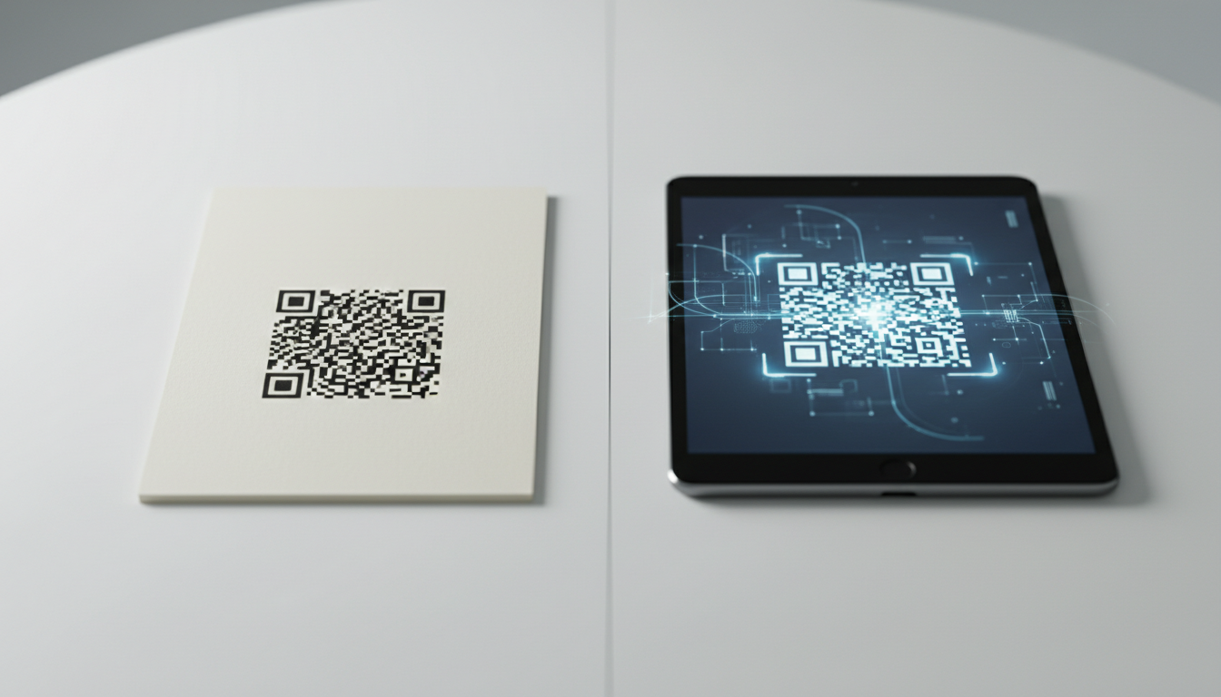
The Science of Scannability: Contrast is King
The primary function of any QR code is to be scanned quickly and reliably. This function hinges almost entirely on the contrast between the dark and light elements of the code. Scanners, whether a smartphone camera or a dedicated reader, rely on distinct light and dark patterns to interpret the embedded data.
Understanding Contrast Ratios
The golden rule for qr code color design is to maintain a high contrast ratio between the foreground (the data modules) and the background (the quiet zone and empty spaces).
- Dark Foreground, Light Background: This is the most reliable and universally recommended combination. The dark modules stand out sharply against a light, preferably white, background.
- Minimum Contrast: While there isn't a universally fixed numerical standard across all scanners, a general guideline is to ensure the foreground color is at least 30-40% darker than the background color. Many recommend even higher contrast, closer to 60-70% for optimal performance in varied lighting conditions.
- Avoid Low Contrast Combinations: Light colors on light backgrounds (e.g., pale yellow on white) or dark colors on dark backgrounds (e.g., navy blue on black) are almost guaranteed to fail. Scanners will struggle to differentiate the data patterns.
The Quiet Zone: Don't Underestimate Its Importance
The "quiet zone" is the mandatory clear space surrounding the QR code. It's typically a white border, at least four modules wide (a module is one of the small squares that make up the QR code). This zone helps scanners identify the boundaries of the QR code and separate it from surrounding visual clutter.
- Maintain Clarity: Never place colors or images within the quiet zone, even if they are light. It must remain clear and free of interference to guarantee scannability.
- Color Implications: If your background color is anything other than white, ensure your quiet zone matches that background color and still provides sufficient contrast against the foreground modules.
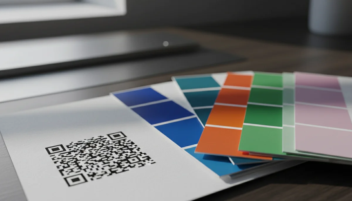
Brand Harmony: Integrating Colors Effectively
Once scannability is assured, the next step in effective qr code color design is aligning it with your brand identity. Your QR codes are an extension of your brand, and their appearance should reinforce your visual language.
Leveraging Brand Guidelines
Your company's brand guidelines are your best friend here. They specify approved color palettes, ensuring consistency across all marketing materials.
- Primary and Secondary Colors: Identify colors from your brand palette that offer high contrast. Often, a dark primary color can be used for the foreground modules, with a light secondary color or white for the background.
- Color Psychology: Consider the psychological associations of your brand colors. Do they convey trust, energy, luxury, or playfulness? Ensure the QR code's appearance subtly reinforces these messages. For example, a finance company might use dark blues and greys, while a children's toy brand might use brighter, more vibrant combinations (while still respecting contrast).
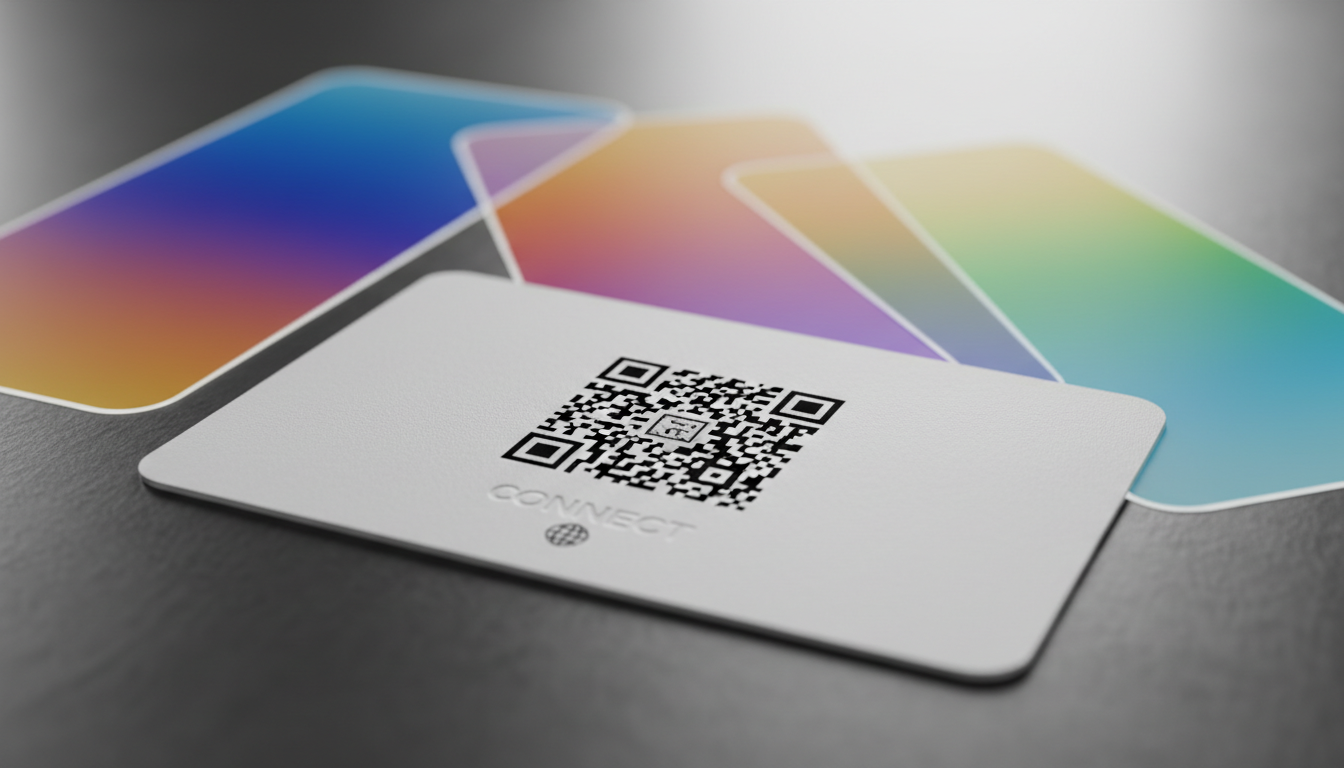
Avoiding Brand-Color Pitfalls
- Gradient Backgrounds: While visually appealing, gradients can severely hamper scannability if the contrast isn't consistent across the entire code. If using a gradient, ensure the data modules remain dark and distinct throughout.
- Complex Logos in the Center: Many advanced QR code generators allow placing a small logo in the center. While this can enhance branding, ensure the logo doesn't obscure too much data or interfere with the core patterns. Keep it small and ensure the surrounding QR code modules maintain their integrity and contrast.
Technical Considerations for Optimal Performance
Beyond contrast and branding, certain technical aspects influence how colors impact a QR code's functionality.
Error Correction Level (ECL)
QR codes have built-in error correction, meaning they can still be scanned even if parts are damaged or obscured. There are four levels: L (7% recovery), M (15% recovery), Q (25% recovery), and H (30% recovery).
- Higher ECL, More Data: A higher ECL means the code contains more redundant data, making it more resilient to damage or subtle color variations. However, it also means the code itself will have a denser pattern, potentially making subtle color choices riskier.
- Color and ECL: If you plan to use less-than-ideal contrast (e.g., a darker background with a slightly lighter foreground, though not recommended), or if your codes will be printed on challenging surfaces, opting for a higher ECL (M or Q) can provide a safety net. However, the best approach is always to prioritize high contrast first.
File Formats and Printing
The medium on which your QR code is displayed significantly impacts color fidelity and scannability.
- Vector vs. Raster: Always use vector formats (SVG, EPS) for QR codes where possible, especially for print. Vectors scale infinitely without losing quality, ensuring sharp lines and accurate color representation. Raster formats (PNG, JPG) can pixelate, blurring the distinction between modules.
- CMYK vs. RGB: For print, specify colors in CMYK. For digital displays, use RGB or Hex codes. Be aware that colors can look different on screen versus print due to variations in color profiles. Always do a test print if the QR code is for a physical medium.
Accessibility: Beyond Scannability
While the primary focus is scanner readability, considering human accessibility is also crucial. High-contrast designs benefit users with visual impairments, making it easier for them to identify the QR code on a page or screen before scanning. This aligns with broader inclusive design principles, ensuring your qr code campaigns reach the widest possible audience.
Practical Examples of Effective QR Code Color Design
Let's look at how different businesses can apply these principles using our services like the Custom QR Design tool.
Example 1: The Modern Coffee Shop
-
Brand Identity: Warm, inviting, artisanal, with a clean, minimalist aesthetic.
-
Brand Colors: Deep espresso brown, creamy beige, and a vibrant teal accent.
-
QR Code Use Case: Restaurant Menu QR Codes on tables, loyalty program sign-ups.
-
Design Strategy:
- Foreground: Deep espresso brown (matches coffee beans, strong contrast).
- Background: Creamy beige (light, warm, inviting).
- Result: High contrast, perfectly on-brand, easy to scan in varied café lighting. The code subtly reinforces the cozy, quality feel of the coffee shop.
- Integration: The coffee shop uses our Restaurant Menu QR Codes to update their daily specials dynamically without reprinting.
Example 2: Music Festival & Event Promotion
- Brand Identity: Energetic, vibrant, high-tech, youth-oriented.
- Brand Colors: Electric purple, neon green, and stark black.
- QR Code Use Case: Event QR Codes on posters, merchandise, social media for ticket sales and schedule updates.
- Design Strategy:
- Foreground: Stark black (maximum contrast, reflects edgy brand).
- Background: Electric purple (vibrant, on-brand, but light enough to ensure contrast).
- Result: A bold, eye-catching code that stands out in a crowded festival environment. The black on purple ensures excellent scannability even on large outdoor banners.
- Integration: Festival organizers use Dynamic QR Codes so they can update event schedules or artist lineups in real-time without reprinting thousands of posters. They monitor scan rates via QR Code Analytics to see which promotional channels are most effective.
Example 3: High-End Fashion Brand
-
Brand Identity: Sophisticated, exclusive, minimalist, luxury.
-
Brand Colors: Charcoal grey, pure white, and a subtle metallic gold accent.
-
QR Code Use Case: Product QR Codes on hang tags, vCard QR Codes on business cards, link to exclusive content.
-
Design Strategy:
- Foreground: Charcoal grey (elegant, sophisticated, strong contrast).
- Background: Pure white (clean, minimalist, standard for luxury).
- Logo Integration: A small, metallic gold version of their logo subtly placed in the center of the QR code, carefully designed not to interfere with scannability.
- Result: A chic, understated QR code that aligns perfectly with the brand's premium image. The charcoal on white is highly reliable.
- Integration: When using our Product QR Codes, the brand links directly to product pages with rich media, styling tips, and care instructions, enhancing the customer experience.
Strategy and Implementation: A Step-by-Step Guide
Follow these steps for successful qr code color design and deployment:
Step 1: Define Your Goal and Medium
Before picking colors, understand where your QR code will live.
- Print vs. Digital: Print on glossy paper, matte, fabric, or a screen? Each medium impacts color appearance.
- Environment: Will it be scanned indoors, outdoors, in low light, or bright sunlight?
- Purpose: Is it for quick information (e.g., URL QR Codes), lead generation (Form QR Codes), or social engagement (Social Media QR Codes)?
Step 2: Select Your Brand-Compliant Color Palette
Consult your brand guidelines. Identify your primary and secondary colors. Pick colors that naturally offer strong contrast within your palette. Remember, dark foreground on a light background is best.
Step 3: Design with a Reliable QR Code Generator
Utilize a robust QR code generator that offers advanced customization. Our Custom QR Design tool allows you to:
- Choose Foreground and Background Colors: Input hex codes for precise brand matching.
- Add a Logo: Upload your brand logo to be embedded in the center, ensuring it's not too large.
- Select Module Shape and Frame: Further customize the appearance while maintaining readability.
Step 4: Test, Test, Test (Crucial for Scan Rates!)
This step cannot be overstated. Never deploy a QR code without thorough testing.
- Variety of Devices: Test with multiple smartphone brands (iOS and Android), models, and QR code scanner apps. What works on one phone might fail on another.
- Different Lighting Conditions: Scan in bright daylight, indoors, and in low-light environments.
- Varying Distances and Angles: Ensure it scans easily from typical viewing distances and angles.
- A/B Testing: For critical qr code campaigns, consider creating two versions with slightly different but equally high-contrast color schemes. Deploy them to a small segment of your audience and use QR Code Analytics to track scan rates. This data-driven approach allows you to identify the most effective design.
Step 5: Monitor and Analyze Performance
Once your QR codes are live, use analytics to track their performance. Our QR Code Analytics provide valuable insights:
- Scan Locations: Where are your codes being scanned?
- Scan Times: When are users most engaged?
- Device Types: Which devices are scanning your codes?
This data can inform future qr code color design decisions, helping you optimize for maximum engagement. If a particular color scheme consistently underperforms, it might be an indicator to revisit your color choices or placement strategy.
Step 6: Maintain Brand Consistency at Scale
For larger organizations or extensive qr code marketing efforts, maintaining design consistency across numerous codes and teams is vital.
- Brand Templates: Utilize our Team Workspace feature to create and share approved brand color templates. This ensures all team members use the correct, scannable color combinations for every QR code generated.
- Bulk Generation: When you need to create hundreds or thousands of branded QR codes, our Bulk QR Generator allows you to apply your approved color designs efficiently, ensuring consistency and saving significant time. This is invaluable for inventory management, personalized marketing, or large-scale event ticketing.
Conclusion
Mastering qr code color design isn't just about aesthetics; it's a strategic advantage. Well-designed codes get more scans, reinforce brand trust, and deliver better data, ultimately driving higher engagement and conversions. By prioritizing scannability through high contrast, aligning with your brand identity, and meticulously testing your designs, you can unlock the full potential of your QR code campaigns.
Start experimenting with these principles today. Use QR-Build's Custom QR Design tool to apply these guidelines, test different combinations, and see the tangible difference in your analytics. Your next highly effective QR code is just a few clicks away.
Ready to Get Started?
Explore our tools to enhance your QR code workflow
Team Workspace
Collaborate with your team on QR code projects. Share templates, manage permissions, and track usage.
Explore TeamsBulk QR Generator
Generate hundreds of QR codes at once from CSV files. Perfect for events, inventory, and mass campaigns.
Start BulkRestaurant Menu QR Codes
Create contactless digital menus for restaurants. Update your menu in real-time without reprinting.
Create MenuAll tools are available with a free plan to get you started
Frequently Asked Questions
Find quick answers to common questions about this topic
Why are some QR codes hard to scan due to color?
QR code scanners rely on sufficient contrast between the dark and light modules. Poor color choices, like low contrast combinations, can significantly hinder a scanner's ability to read the code accurately, leading to failed scans and user frustration.
What is the recommended contrast ratio for QR code colors?
A general guideline is to ensure at least a 3:1 contrast ratio between the foreground (data modules) and background colors. However, a higher ratio like 4:1 or even 5:1 is often safer, especially for smaller codes or diverse scanning environments to ensure reliability.
Can I use my brand colors for QR codes?
Yes, you can effectively use brand colors for your QR codes to maintain consistency and strengthen brand recognition. However, always prioritize scanability by thoroughly testing the color combination to ensure sufficient contrast and readability across various scanning devices and conditions.
Should I avoid certain color combinations for QR codes?
Yes, avoid light colors for the foreground and dark colors for the background, or colors with similar luminance. Red on green, blue on black, or light yellow on white are common problematic combinations. Always test extensively before deployment.
Does a QR code's background color matter?
Yes, the background color is crucial as it provides the essential contrast against the data modules. A clean, plain, and light-colored background generally works best, allowing the darker foreground elements to stand out clearly for optimal scanning performance.
Related Articles
Continue exploring QR code strategies and best practices

How QR Code Scanner Technology Works: A Simple Explanation
Ever wondered how QR code scanner technology deciphers those complex patterns? Discover the simple process of scanning, from optical readers to data conversion. Learn wha

What is a QR Code? Understanding How QR Codes Work & Technology
Curious about QR codes? Discover what a QR code is and how it works. This guide explains the ingenious QR code technology, connecting physical to digital information effo
How Dynamic QR Codes Work: Your Guide to Editable QR Codes
Discover how dynamic QR codes allow you to update content even after printing. Learn the benefits of an editable QR code for campaigns, menus, and business.

Boost Your Brand: How to Use a Custom QR Code Domain
Discover how a custom QR code domain elevates your brand's professionalism and user trust. Learn to set up and leverage a custom QR code domain for all your marketing and
Static vs Dynamic QR Code Explained: Benefits of Dynamic QR
Understand static vs. dynamic QR codes. Learn the benefits of dynamic QR codes for marketing, tracking, and content updates. Essential for modern campaigns.

Unlocking Insights: How QR Code Analytics Boost Marketing Campaigns
Discover how QR code analytics provide real-time insights into user engagement, scan locations, and campaign performance. Optimize your marketing strategies with powerful

QR Technology Specialist
Sarah has over 8 years of experience in digital marketing and QR code technology. She specializes in helping businesses implement effective QR code strategies.